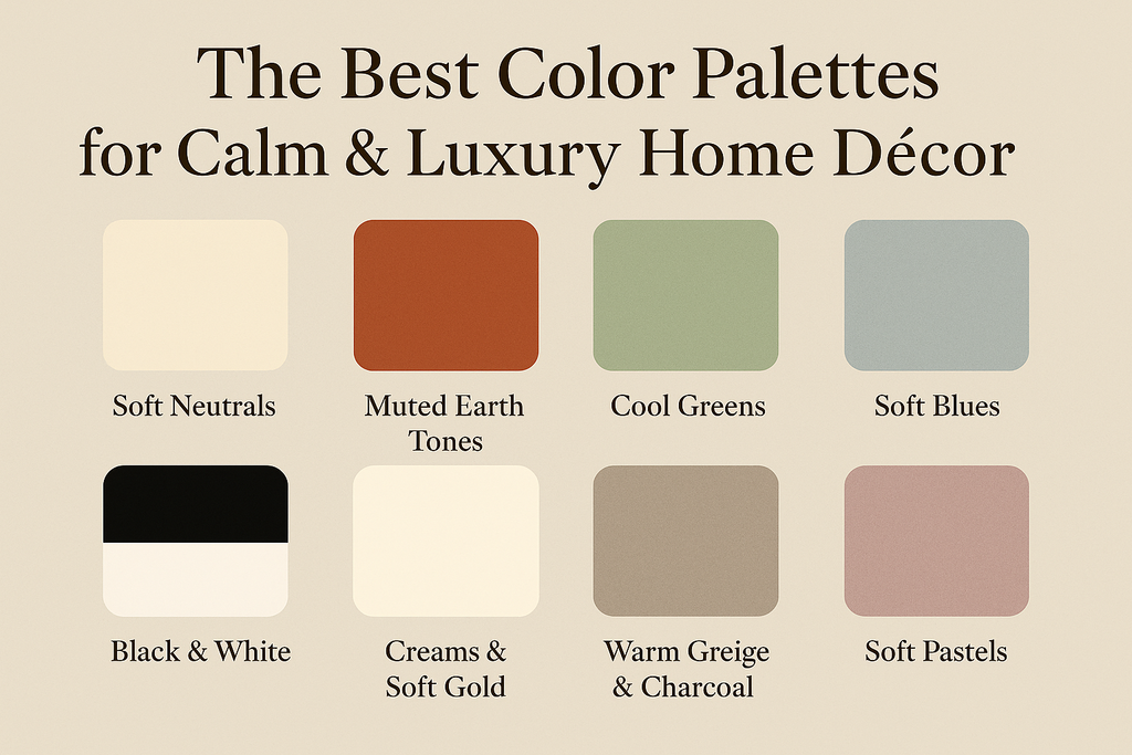
The Best Color Palettes for Calm & Luxury Home Décor
Where serenity meets sophistication.
In a world that constantly rushes forward, a calm home is a quiet form of luxury. And at the heart of every soothing, elegant interior lies a deliberate color palette—one that shapes the atmosphere before any furniture or artwork enters the room.
Choosing the right colors is not simply a design decision.
It’s emotional architecture.
It determines how a room feels the moment you step inside.
Below are the most timeless palettes for creating a home that feels both serene and distinctly luxurious.
Soft Neutral Foundations: The Essence of Calm
No palette communicates quiet luxury more effortlessly than warm neutrals.
Think stone, ivory, sand, oatmeal, warm beige, greige, and soft mushroom tones.
Why they work:
-
They make any room feel more spacious and breathable
-
They pair beautifully with natural materials like linen, wood, and ceramics
-
They create a perfect backdrop for fine art prints and sculptural décor
Neutrals don’t compete for attention—they let the beauty of form, texture, and light shine.
Muted Earth Tones for Warm Minimalism
Earth-inspired tones bring grounding energy into a space while maintaining refinement.
Key shades:
-
Terracotta blush
-
Smoky clay
-
Olive brown
-
Dusty sage
-
Burnt caramel
These colors add warmth without noise.
Used sparingly, they introduce softness and natural depth—perfect for minimalist homes that don’t want to feel cold.
Pair them with:
-
Light oak or walnut
-
Matte ceramics
-
Abstract art with organic shapes
-
Soft woven textiles
The result is calm, warm, and subtly luxurious.
Cool Greens for a Quiet, High-End Atmosphere
Few colors create tranquility and sophistication the way green does—especially sage, eucalyptus, moss, and muted olive.
Why this palette feels luxurious:
-
It mimics the tones of nature, instantly relaxing the mind
-
It pairs with gold accents for elevated elegance
-
It works beautifully with modern, Japandi, and Scandinavian interiors
Sage walls, cream furniture, and a statement art print?
Effortless serenity.
Soft Blues That Evoke Air, Water & Light
Pale blues, misty blues, and desaturated slate tones create a peaceful interior with a gentle cooling effect.
They are ideal for:
-
Bedrooms
-
Reading corners
-
Art-focused living rooms
Blue brings clarity and calm, especially when paired with:
-
White oak
-
Linen curtains
-
Minimalist artwork
-
Soft lighting
It’s the color palette that makes you exhale.
Black, White & Warm Metal Accents: The Signature of Quiet Luxury
Luxury doesn’t need to be loud.
A palette built on deep black, crisp white, and brushed gold feels intentionally modern and undeniably high-end.
Use black sparingly—like handwriting signature strokes:
-
A black-framed art print
-
A sculptural vase
-
Table lamp with matte black finish
Add warmth through gold, bronze, or champagne metal accents, and the room instantly feels curated.
This palette is perfect for homes that embrace editorial simplicity.
Creams, Pearls & Soft Gold for Understated Elegance
If you love interiors that glow with softness, this palette is your muse.
Think:
-
Pearl cream
-
Warm white
-
Soft gold
-
Champagne beige
It creates a luminous, hotel-like atmosphere without feeling formal.
This combination pairs beautifully with silk cushions, abstract art in gentle tones, and glass or marble surfaces.
It’s quiet grandeur.
Warm Greige & Charcoal: The Modern European Palette
Greige (a blend of grey + beige) has become a staple for luxury interiors because it’s versatile, calming, and richly sophisticated.
Pair with:
-
Charcoal details
-
Taupe fabrics
-
Black-framed artwork
-
Natural stone
This palette brings depth without heaviness—perfect for contemporary art lovers.
Soft Pastels Reimagined for Adults
Pastels no longer mean “cute” or “childlike.”
When desaturated, they become deeply serene and stylish:
-
Dusty blush
-
Muted lavender
-
Foggy mint
-
Pale peach
These tones feel modern while adding personality to an otherwise neutral interior.
Keep the palette matte, not glossy, to maintain softness.
Final Thought: Luxury Lives in Harmony
A luxurious home is not defined by expensive objects.
It’s defined by cohesion, calmness, and color harmony.
When colors flow gently from wall to furniture to artwork, the space feels intentional and deeply peaceful.
The right palette makes your home feel like a sanctuary—
a place where beauty, silence, and comfort coexist effortlessly.
If you're curating art prints to complement your color palette, explore serene, elegant fine art collections at:
👉 studioleha.com
-
Đăng trong
Tips
