5 Mistakes People Make When Buying Art Prints (and How to Avoid Them)

Choosing art for your home should feel inspiring — not confusing.
Buying art prints is one of the easiest ways to bring personality, warmth, and beauty into your home. But with countless options online, it’s also easy to make a choice that you later realize doesn’t fit your space, your style, or the quality you expected.
Whether you’re building an art wall or buying your first fine art print, here are the five most common mistakes people make — and how to avoid them so your home feels truly curated.
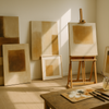
1. Choosing Art Prints That Are Too Small for the Wall
One of the biggest reasons art looks “off” in a room is simple: the print is too small.
A tiny print on a large blank wall creates a feeling of emptiness, no matter how beautiful the artwork is.
In most cases:
-
The art should be at least half to two-thirds the width of the furniture beneath it.
-
Large walls often require larger prints or a curated gallery set.
If you’re unsure, go bigger — most people are surprised by how much more balanced the room feels.
2. Ignoring Color Harmony With the Room
People often pick art they love… but forget to consider whether it fits the room’s atmosphere.
You don’t need to match colors perfectly, but your print should complement the space:
-
Neutral rooms love warm earthy tones
-
Minimalist interiors pair beautifully with black-and-white abstracts
-
Cozy spaces shine with soft, textured, or botanical pieces
-
Modern spaces feel alive with bold contrasts
A print should feel like it belongs — not like it’s fighting for attention.
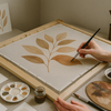
3. Buying Low-Quality Prints That Fade Over Time
Not all art prints are created equal.
Some online shops use cheap ink or thin paper that fades, curls, or discolors after a few months — especially in humid climates.
Look for:
-
Museum-grade or giclée printing
-
Matte or textured fine-art paper (archival quality)
-
High-resolution artwork
-
Clear information on materials and printing standards
A high-quality print is an investment. It stays beautiful for years, not weeks.
4. Choosing Art Based on Trends Instead of Personal Meaning
Trends come and go. Your home should still feel like you.
Many shoppers buy prints because they’re popular on Pinterest or TikTok — only to grow tired of them quickly.
Instead, focus on:
-
What emotion the artwork gives you
-
Whether it matches the energy of your home
-
Whether you’d love it even 3 years from now
Art should create connection, not pressure.
5. Overlooking Frame Choice — Half of the Artwork’s Impact
A beautiful print can look cheap in the wrong frame.
A simple print can look expensive in the right one.
Common framing mistakes include:
-
Using frames that clash with the interior style
-
Choosing glass with strong glare
-
Letting the print touch the glass (causes moisture damage)
-
Picking frame colors that fight with the artwork
Neutral wood, matte black, or soft white frames are timeless choices — especially for abstract or minimalist prints.
If you want a gallery-like feel, choose frames with:
-
UV-protected acrylic
-
Acid-free backing
-
Clean, minimal borders
Framing is an art in itself.
Final Thoughts: Choose Art That Feels Like Home
Buying art prints should be joyful — a moment to express who you are.
By avoiding these five mistakes, your home will feel more intentional, more balanced, and filled with pieces that truly reflect your style.
If you're looking for high-quality fine art prints with a warm, modern aesthetic, explore curated collections at:
Each piece is created with premium materials designed to last, even in humid climates like Vietnam.
Let your home tell a story — one artwork at a time.
-
Đăng trong
Tips


)